

Thanks to everyone who took the time to complete the 2024 Lemmy.nz Census survey!
I asked for volunteers to proof read but got no offers so let me know if anything needs fixing. Especially let me know if terminology I have used is incorrect, I know some words hold a lot of weight to some people.
All fully completed surveys are included in this summary, if someone didn’t submit, their partial responses are not included. No questions were mandatory so if someone didn’t answer the question, it’s not included in the results unless specified.
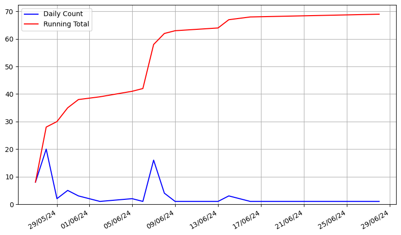
Overall, we got 69 responses, which is pretty good I think. On average (mean), it took 5 minutes 40 seconds to complete. The median was 4 minutes 39 seconds. The longest was just over 30 minutes, and the shortest was a little under 2 minutes.
You can see here the number of submissions each day in blue, and the running total in red. There was a spike when first posted, and a further spike when I posted a reminder post. The final submission was when I reopened the survey for a day on request as someone hadn’t managed to complete the survey and wanted to.
Let’s get into the actual responses. I’ve been told I should stick to bar charts because “pie charts are for marketing and pizza”, but I think it’s nice to represent some of these as proportions. However, where I’ve used a pie chart I’ve also included a bar chart in spoiler tags. I know in the past some apps have had trouble with spoiler tags, so if you have issues maybe read this on desktop. It’s a lengthy read anyway!
Where are we?
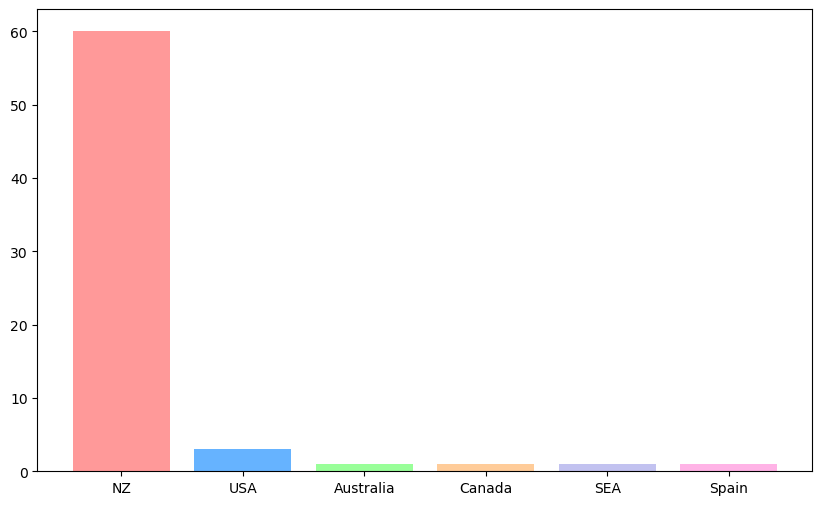
Where do you live?
In a result that will shock no one, the vast majority of responses came from people living in NZ.
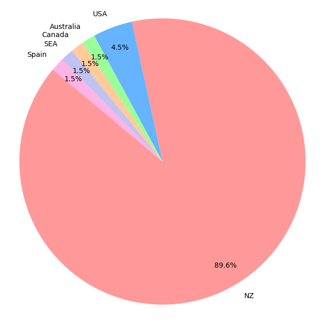
Bar graph
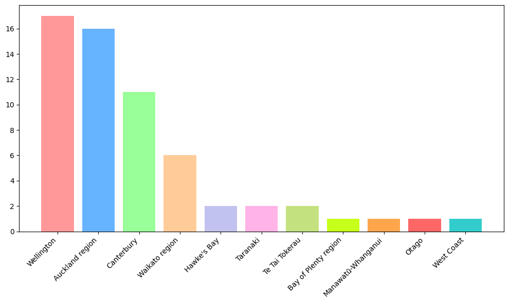
Within NZ, Wellington is over represented but otherwise we seem to be spread out rather evenly by the population of each area. To my knowledge, /r/wellington is the only subreddit that had a post about Lemmy with any traction, so I presume this is the reason for the higher proportion of Wellingtonians.
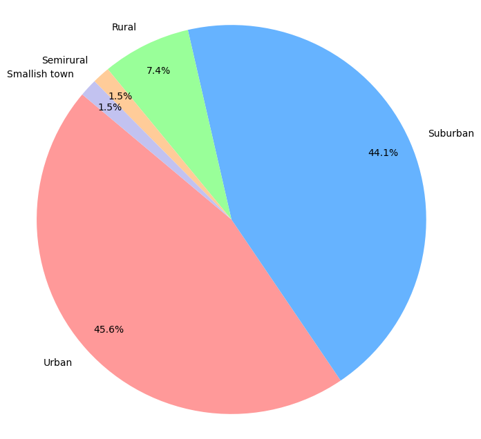
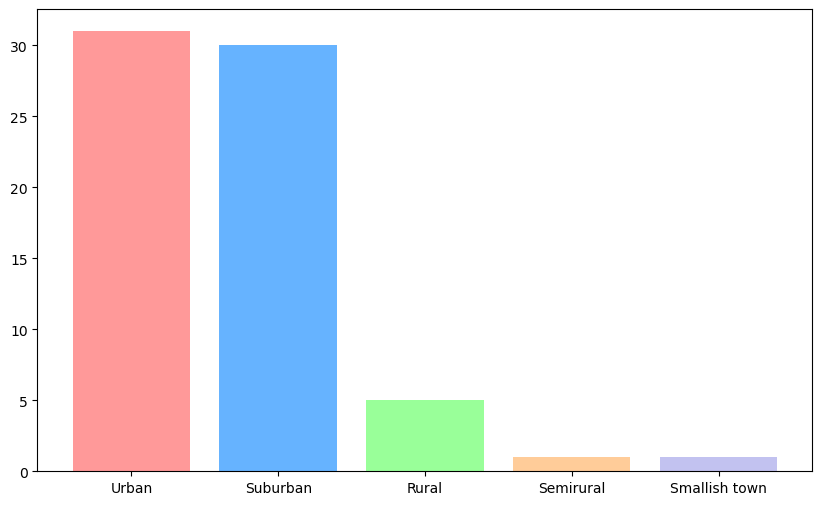
How big is your community?
Most of us live in urban or suburban areas, with some write in options. Nationally, around 15% of us live rurally, but for survey respondents this was around 7%.
Bar graph
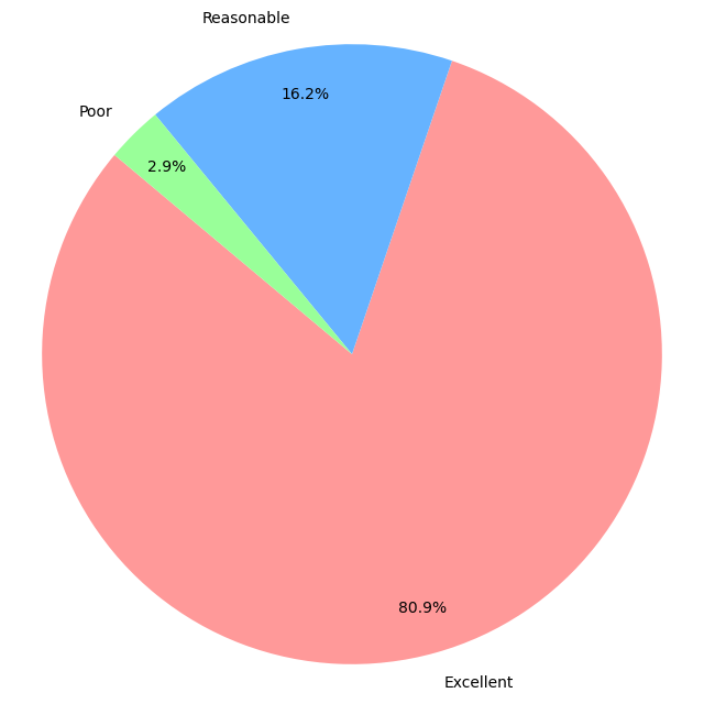
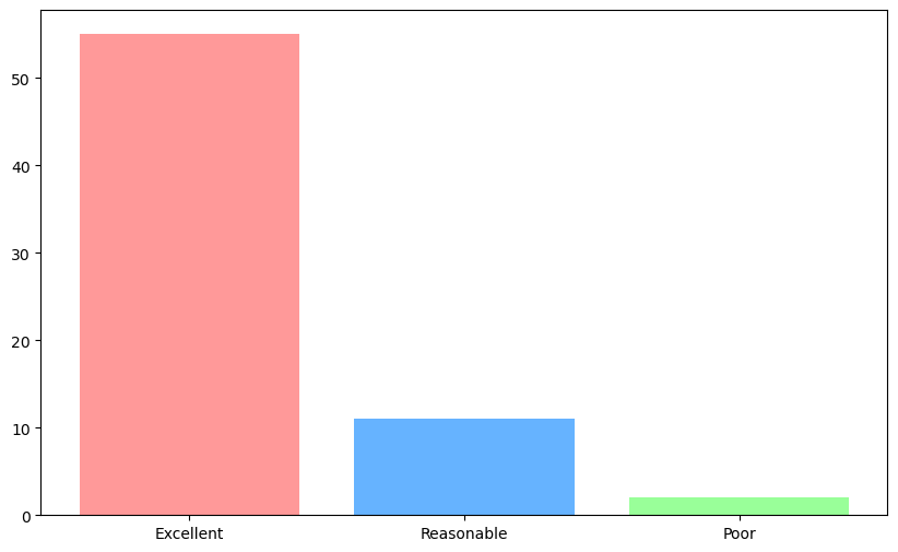
In your opinion, what is the quality of your internet connection?
Most of us think our internet quality is great, with almost 81% stating the quality of their internet connection is Excellent.
Bar graph
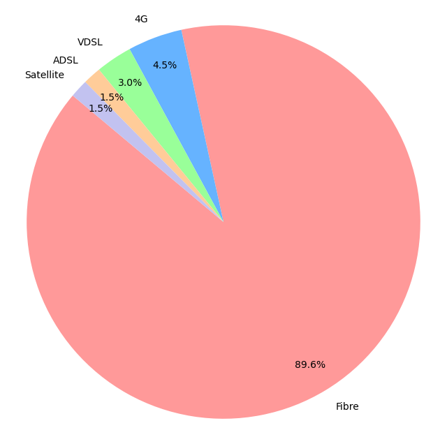
This makes sense, since most of us have fibre.
Bar graph
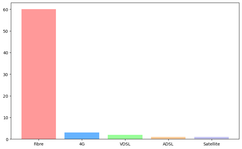
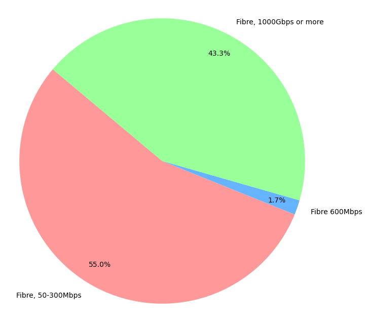
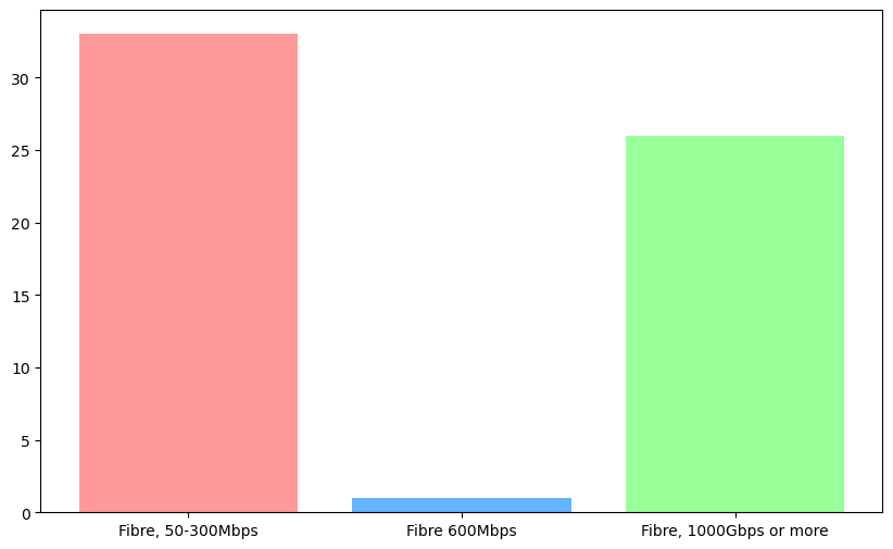
Within those with fibre, we are pretty evenly split on being under 300Mbps and over 1000Mbps. I foolishly forgot to add an option in the middle, but one person responded 600Mbps in their “Other” option.
Bar graph
Who are we?
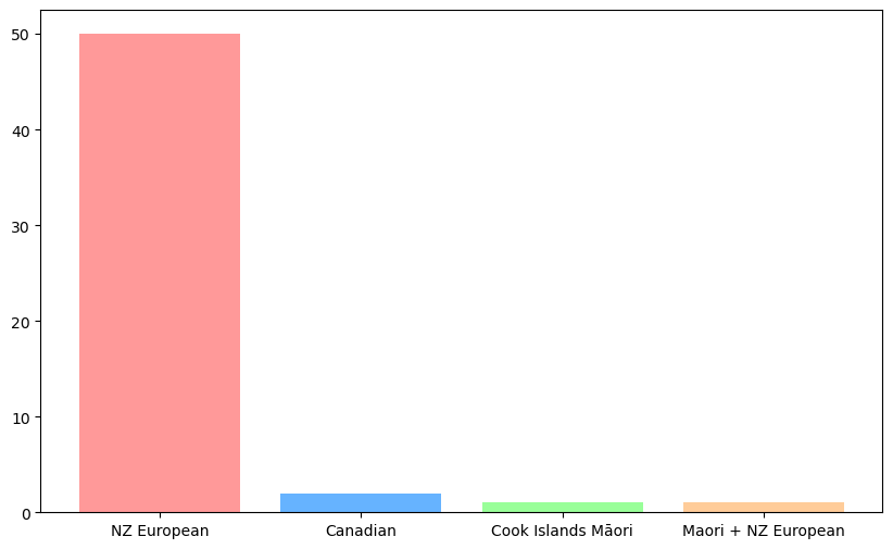
What is your ethnicity?
We are a pretty white bunch. Way less ethnic diversity than I was expecting. The 2023 NZ census showed around 44% of people identify with Māori, Asian, or Pacific enthnicities, so we are remarkably different from the general population. Three people indicated they preferred the term “Pākehā” to “NZ European”, though these are grouped together.
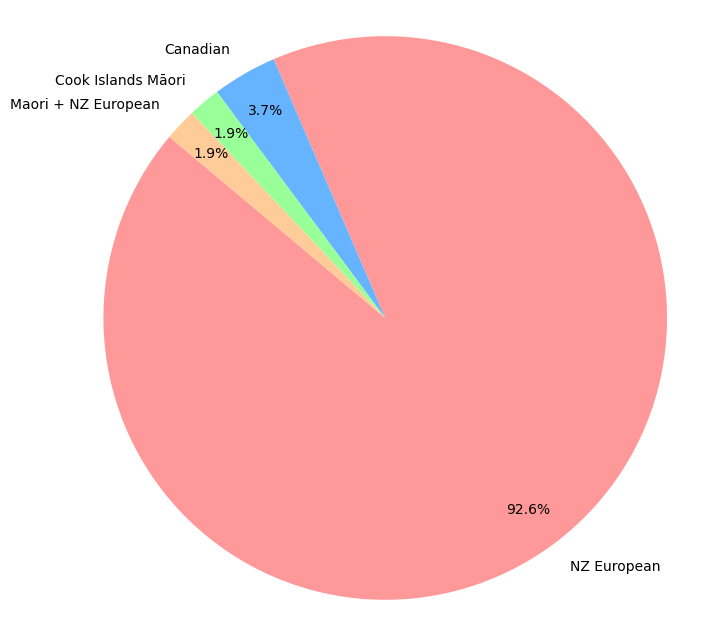
Bar graph
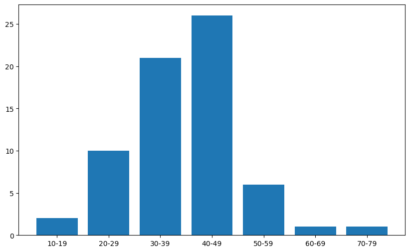
What age range do you fall into?
We have a reasonably older age than perhaps reddit does, but this is largely in line with Lemmy.ca and probably Lemmy as a whole.
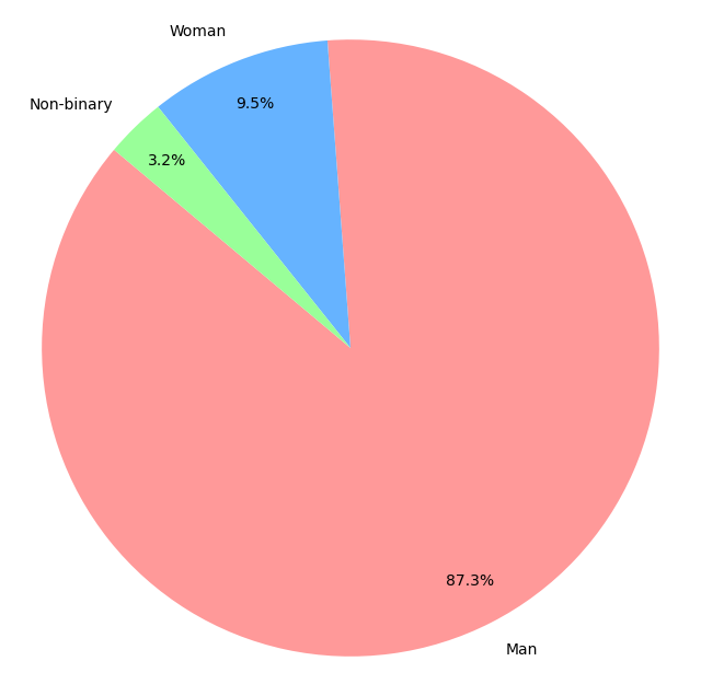
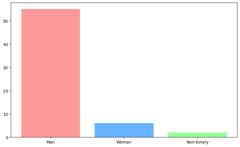
What is your gender identity?
We are mostly men here, with this spread being broadly in line with Lemmy.ca’s results, so this may be representative of Lemmy. We do have a higher proportion of women and a lower proportion of people who are non-binary, but this is probably due to normal variance with the low sample size.
Bar graph
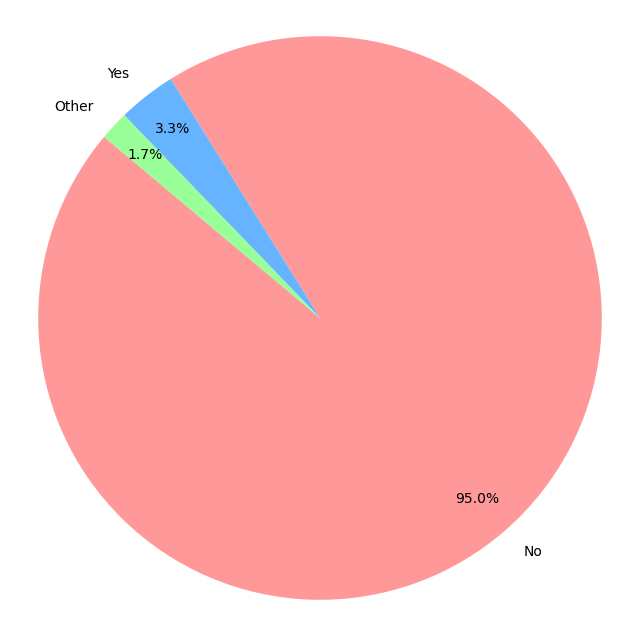
Are you someone with trans experience (meaning your gender identity does not align with your sex assigned at birth)?
Two users identified as trans, and these users both identified as non-binary in the previous question. One user selected Other and indicated they have a gender identity for society, not for themselves.
Bar graph
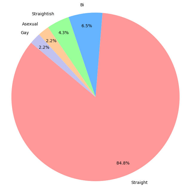
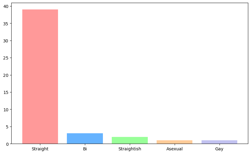
How do you identify?
Almost 85% of us identified as straight, or 91% if you include those identifying as “straightish”. This value is much lower than the general population. StatsNZ reports (based on a survey, not a census) that 4.1% of NZ belong to what StatsNZ referred to as the “sexual minorities population”, compared to 9-15% of respondents (depending on how you categorise “straightish”).
Bar graph
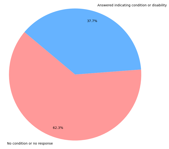
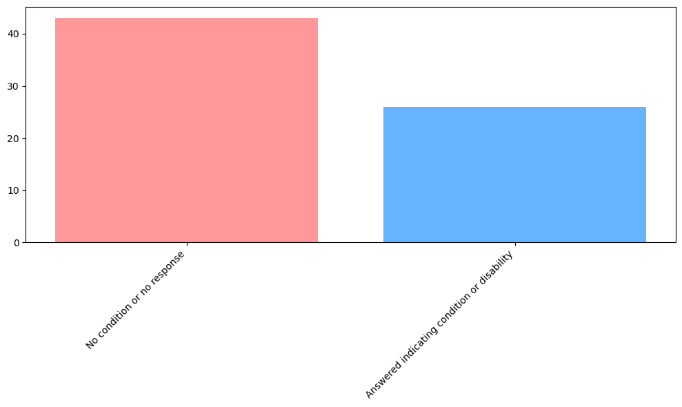
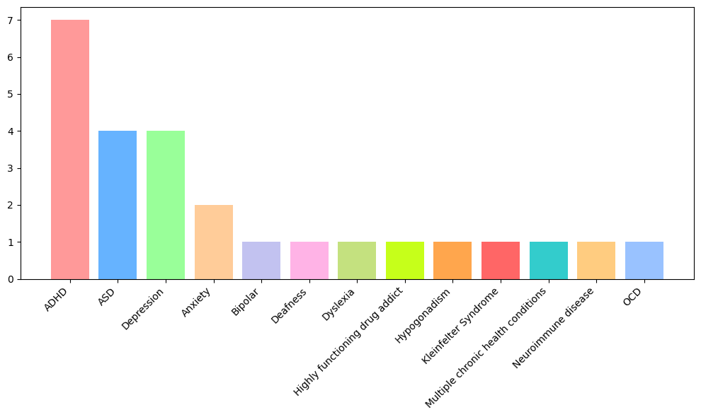
What is your disability status?
To start, here is a graph of all respondents vs those that indicate a disability. Note that we did not have a way to differentiate between someone without a disability and someone who didn’t want to answer the question. 8 people specifically said they don’t have a condition or disability.
Bar graph
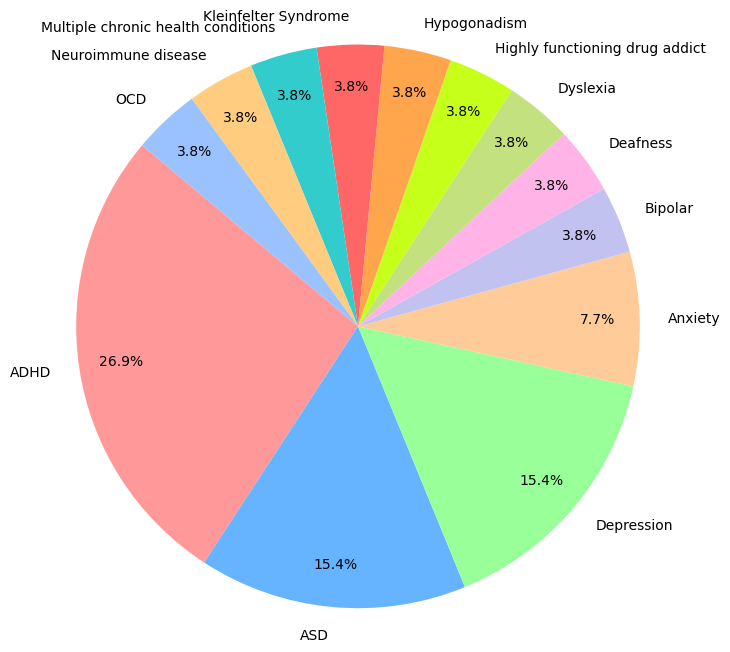
For those that indicated a condition, we see quite a range. For this question, there was a free text field and answers don’t nicely group, so in the interest of having a graph I have tried to nudge them into categories. Mostly, this means if someone wrote “Probably” or “Maybe”, I’ve assumed they have this condition. Hopefully I haven’t miscategorised anyone, but remember to take this with a grain of salt.
Also, conditions are listed separately. If someone listed three conditions, they will show as three items in this graph.
Bar graph
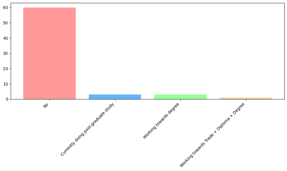
Are you currently studying?
Around 10% of us are studying at the moment.
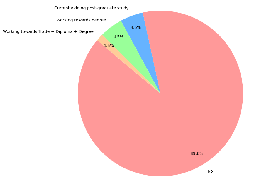
Bar graph
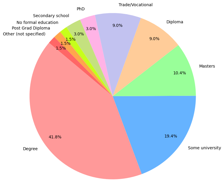
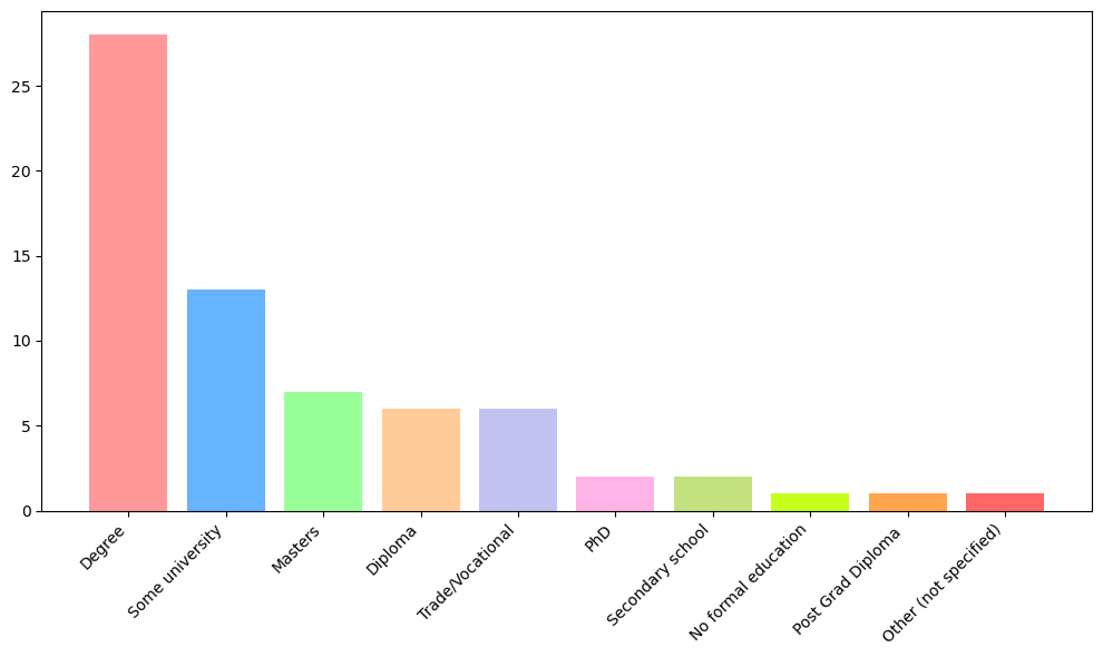
What is your highest level of education achieved?
Almost 75% of us have a post-secondary school qualification! I thought I might find some cool relationship between the people who indicated ADHD and the people who had completed “Some university”. Despite 10 of the 13 who completed “Some university” indicating they were not currently studying, only one of these people indicated ADHD (and in fact, this was the only person in the group indicating any disability or condition).
Bar graph
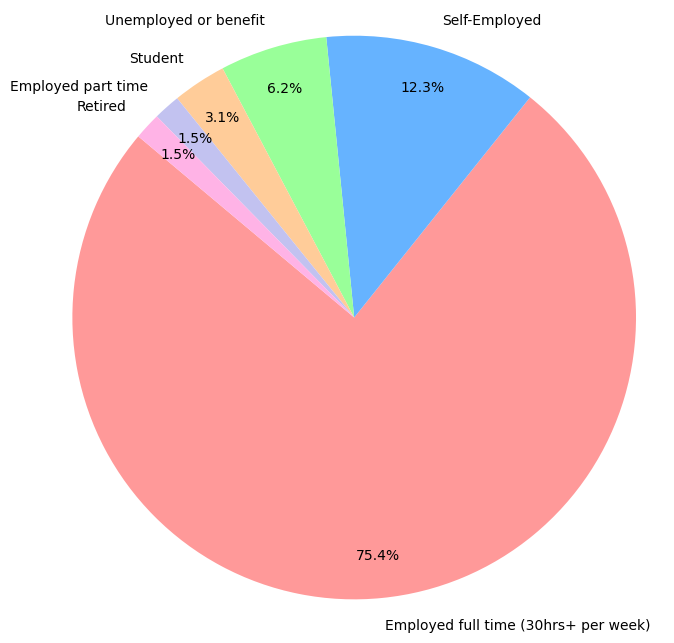
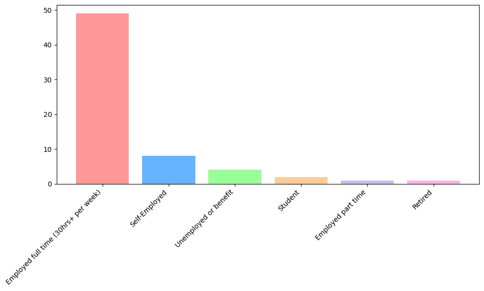
What’s your employment status?
89% of us are in paid work, which is higher than Lemmy.ca’s results, but this could be due to having a lot fewer respondents so a single person’s answer can change the outcome by a fair bit.
Bar graph
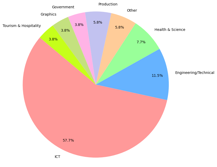
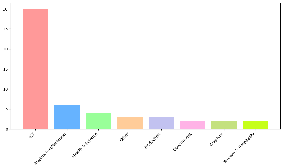
If employed, what field of work do you work in?
This question was a free text field. I have tried to group them into similar categories. This was hard, especially since there’s not a detailed job description for each, so take this with a grain of salt. Without these groups, there were many different answers with just one respondent with that answer. But rest assured we have everything from mechanics and plumbers, tourism operators and hospitality workers, researchers, archivists, engineers, manufacturers and those that do film visual effects. And this is all on top of the 57% of us that work in Information and Communication Technology (IT and communication). 23% of respondents listed just “IT”, and a further 23% stated “Software Developer”, “Software Engineer”, or “Web developer”.
Bar graph
Lemmy and us
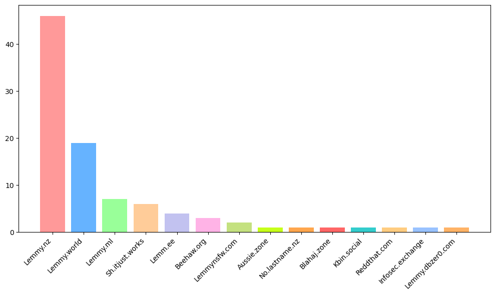
Which instances do you have an account on?
Unsurprisingly, the largest group was lemmy.nz, followed by the larger Lemmy instances. Note that this was multiselect, so a user may be listed in more than one place.
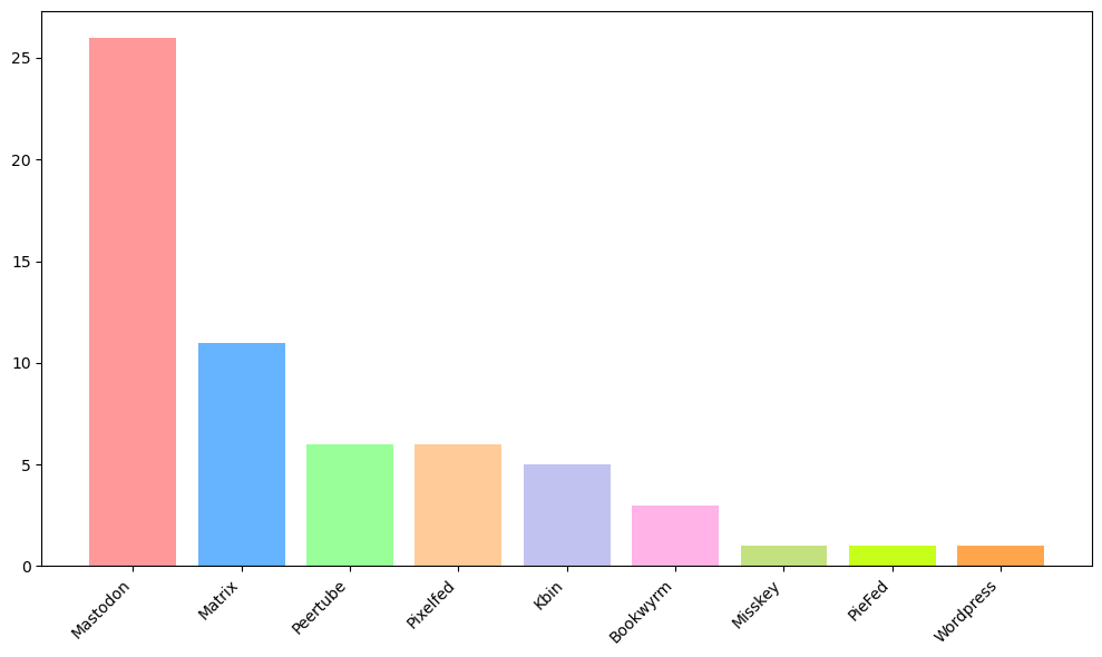
What other Fediverse services do you use?
Lots of Mastodon users. Many use Matrix as well, which is unsurprising since Matrix chats are quite common with Lemmy, and Lemmy even allows a Matrix account to be linked to a Lemmy account to add a button to message a user on Matrix. And on top of that, we have a Matrix chat which would also encourage people to use Matrix.
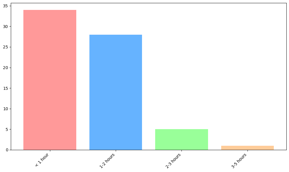
On average, how much time do you spend on Lemmy each day (whether on Lemmy.nz or other instances)
Most people are here less than 2 hours a day, which is similar to Lemmy.ca’s results.
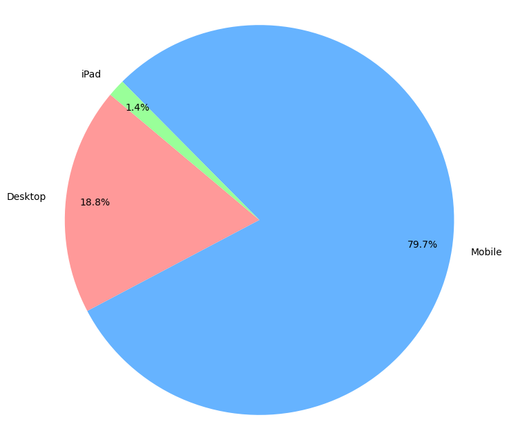
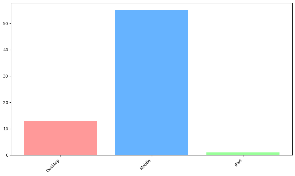
How do you access Lemmy most often?
Most of us use mobile more often than desktop to access Lemmy. There was one “Other” selection stating “iPad”.
Bar graph
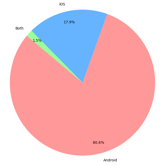
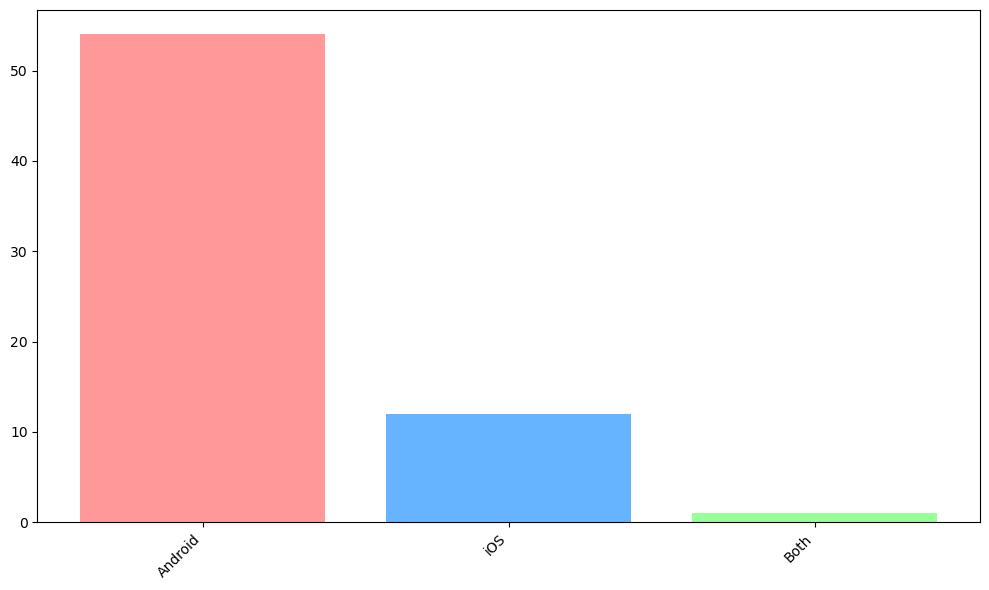
On mobile, which OS do you use?
Over 80% of mobile users are using Android. We had users state GrapheneOS and CalyxOS (one each), I have included these in Android. We also had one user write “Both”, which I have added.
Bar graph
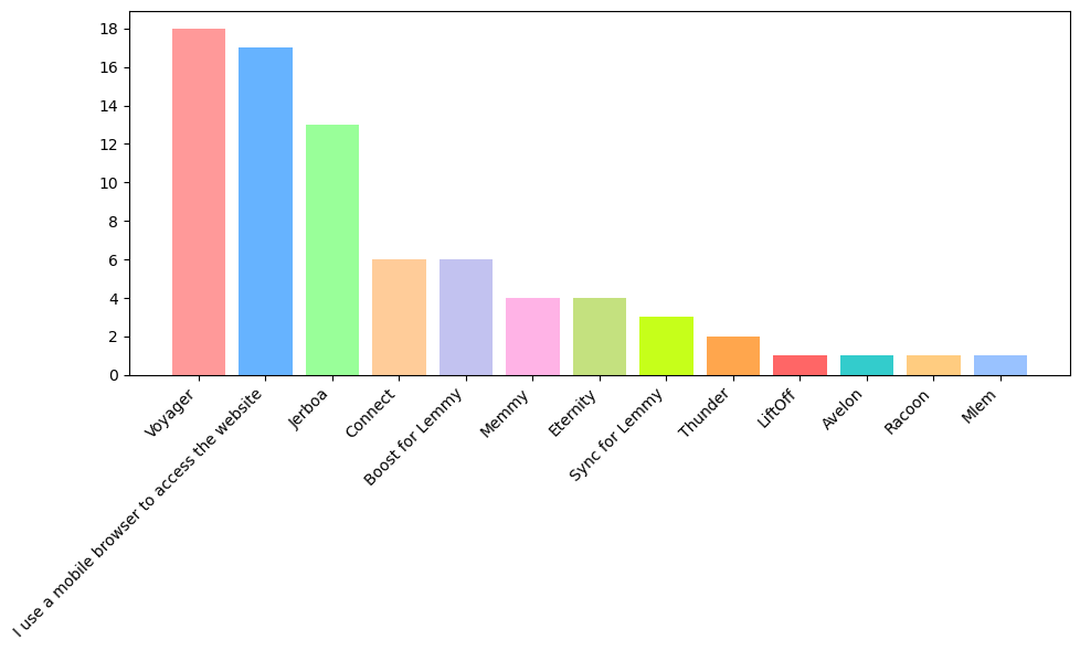
On mobile, which app(s) do you use?
The most popular app was Voyager, followed by just using the website in a mobile browser. This was actually quite different from Lemmy.ca, who had Sync as their most popular, followed by Jerboa and then Voyager.
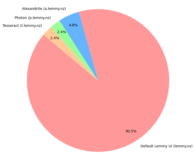
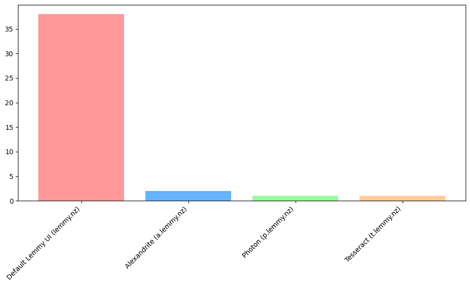
On desktop, which interfaces do you use?
On desktop, people tended to only use the default Lemmy UI. This may partly be because it’s not particularly obvious that our other frontends exist.
Bar graph
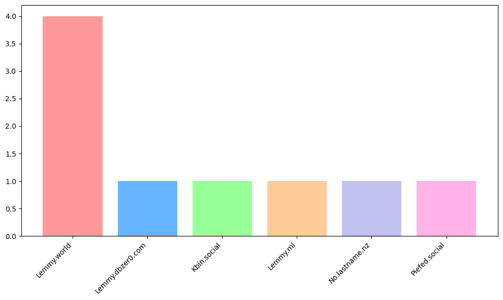
If you primarily access lemmy.nz through a different Lemmy/Kbin/Mastodon/etc instance, please list it below
For those not directly accessing through Lemmy.nz, Lemmy.world was the only instance with multiple people using it as their primary way of accessing Lemmy.nz.
Final questions
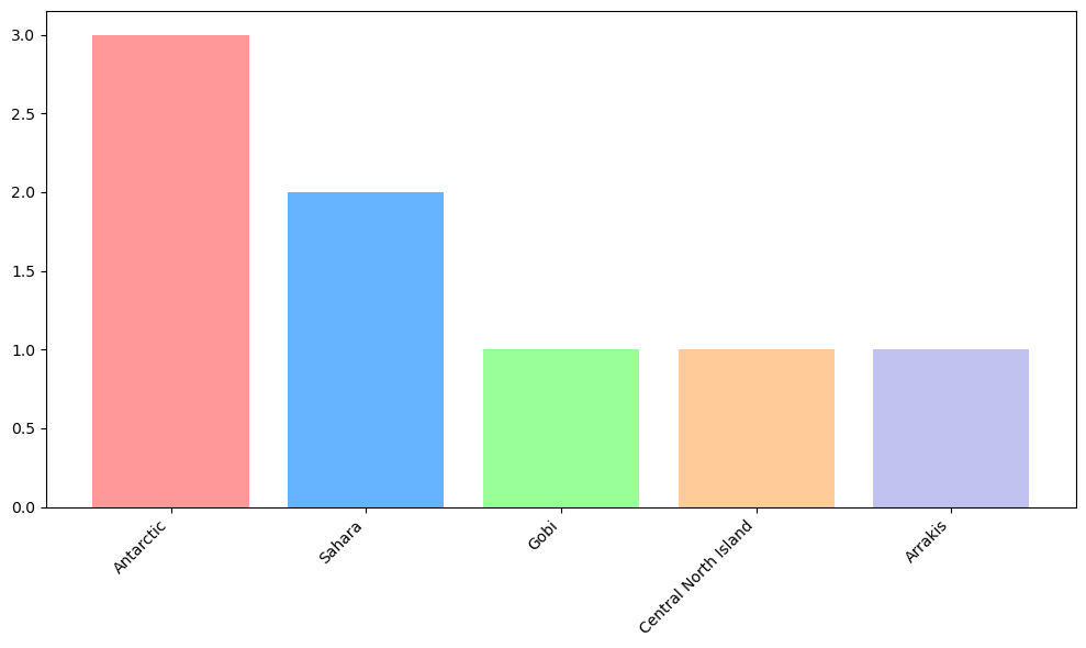
What’s your favourite desert?
I’m an idiot and, after reading the Lemmy.ca answer about The Sahara, accidentally wrote Desert instead of Dessert.
For favourite Desert, we have three votes for the Antarctic/Antarctica, two for Sahara, and one each for Gobi, Central North Island, and Arrakis.
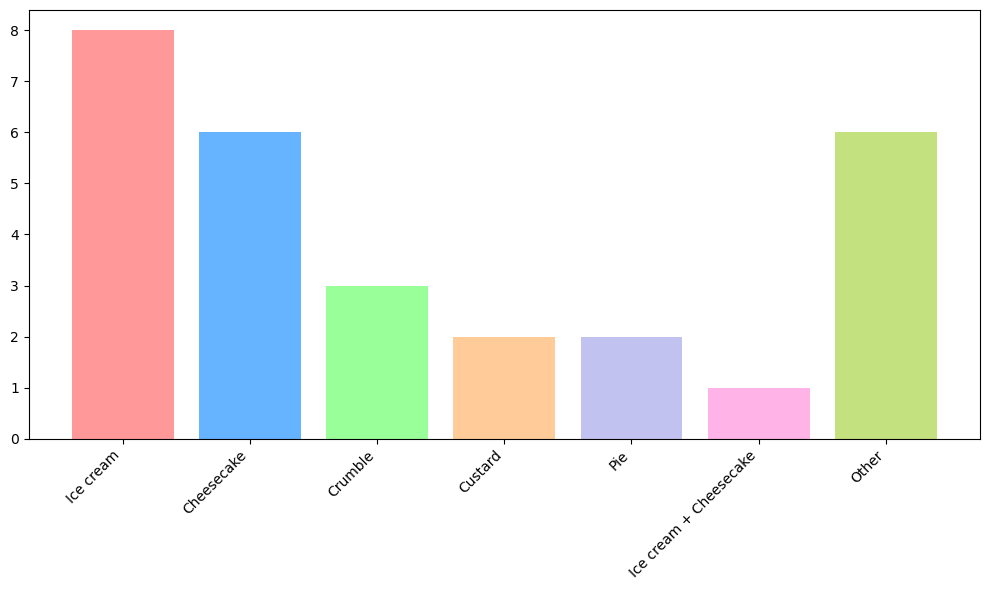
For favourite Dessert, I have grouped and graphed the results, though I am sure to have offended someone with my groupings. The top answer was ice cream, followed by cheese cake, which mirrors Lemmy.ca’s results. One person decided “Ice-cream cheescake mix” was their favourite, which is not counted in either category and is instead listed separately.
Of those that answered with a dessert, here is the full list:
- Apple crumble x 2
- Blackberry and apple crumble
- Cheesecake x 2
- Cheesecake!
- Cheesecake, Strawberry
- Chocolate
- Chocolate chip cookies
- Cookies and cream ice cream
- Creme brulee
- Custard
- Don’t eat sugar
- Halo halo
- Home made pav with fresh strawberries
- Ice cream x 3
- Ice-cream cheescake mix
- Kapiti Ice Cream
- Much Moore’s Double Choc Fudge Ice-cream
- Peacan pie
- Revenge
- Strawberry rhubarb pie
- Tarta de queso
- Tiramisu
- Tub of jelly tip ice cream
- Vegan Cheese Cake
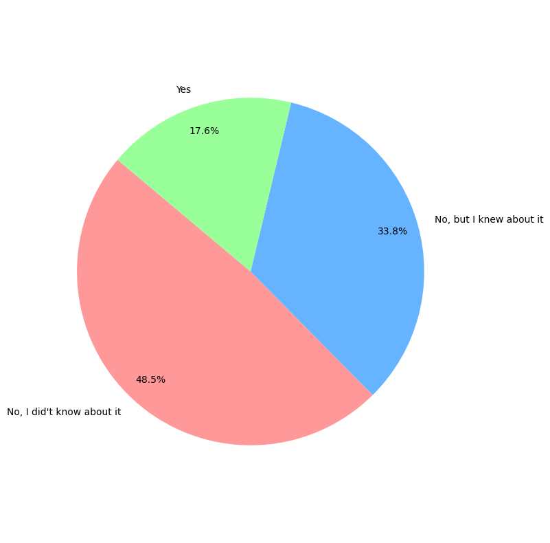
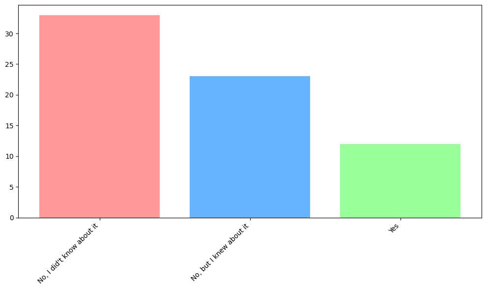
Do you use the Matrix chat?
Almost half of people didn’t know we have a Lemmy.nz Matrix chat room. Now you do! You can find instructions for joining here. If you’re having trouble, reply in the post and we can offer help.
Bar graph
Are there any communities you would like to see created on Lemmy.nz?
There were a handful of suggestions here, but no two people suggested the same thing. Firstly, we have a post here that outlines some NZ communities across Lemmy. It hasn’t been updated in some time, so feel free to reply with any that you know of to be added.
Some people replied with things they don’t want, but I have filtered this out as people can block communities they don’t want to see.
- /r/diynz
- A dedicated outdoors community
- Hurdy gurdy discourse
- More regional NZ content
- NZ mechanics, stained glass, or growing weed.
- Something cheesy/cringe where we mock ourselves, kuhy-wee accent and maybe even small town monuments, etc. Almost nostalgia bit with shit posting and rivalry… Still got a way to go, but I reckon the ideas got legs. Bring back top town!
- thetron - Hamilton
In my view, I’d think most of these would be better posted to the !newzealand community, which has the bigger userbase. Some exceptions:
- Growing weed - there’s [email protected]
- Outdoors - there’s [email protected]
- Mocking outselves - this might be better in [email protected]
I’m also not sure we have the population to support a Hamilton community. Originally the idea was anyone in the top half of the North Island could use [email protected], anyone in the bottom half could use [email protected], and then we had [email protected]. We intended to split communities as they got too big, which I don’t think has happened, especially since we have a comment about wanting more regional content.
I also think people should feel comfortable posting things to the [email protected] community if they don’t fit in another community, even if it’s not relevant to all of NZ. Others may have a different view, but I would be wary of fragmenting the users across too many communities.
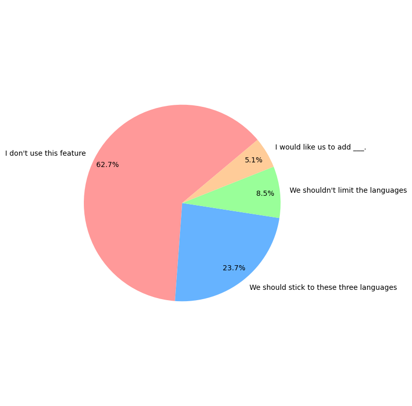
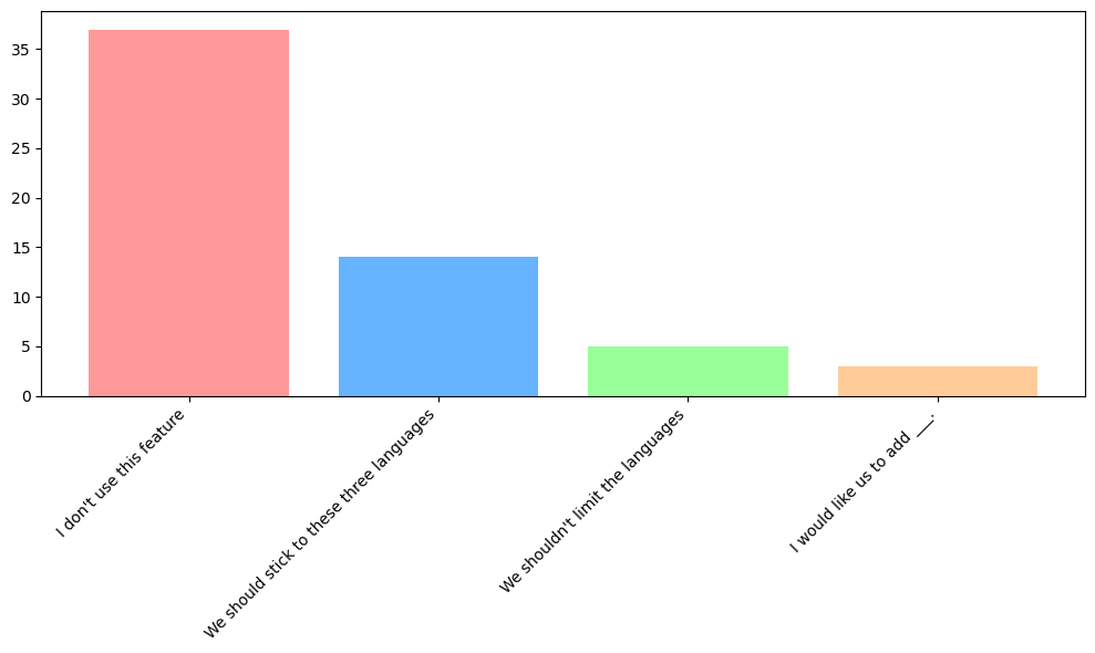
What are your thoughts on the Lemmy.nz post and comment language options?
The options here were:
- I don’t use this feature and don’t have an opinion.
- We should stick to these three languages, as it makes it easier to find the language I want
- We shouldn’t limit the languages, all should be available.
- We should use a small list of languages, but I would like us to add ___.
I have shortened them in the graphs so they fit.
Bar graph
We had some comments as well.
One user mentioned Māori would never be used, I’d counter argue that it’s weirder for an NZ instance to actively not allow it than it is to have it as an option.
Someone mentioned they didn’t know it was an option. On the website, there is a dropdown box under the box where you write your post or comment. If you use an app this could be in a different place. There are plans to have Lemmy auto-fill this in future.
One comment saying NZ Sign Language isn’t an option, and we should support it as it’s an official national language. Unfortunately Lemmy doesn’t support sign languages at this time, so we will have to try to think of another way users can communicate non-audibly. If anyone has any suggestions, I’m all ears.
One comment asking for Cantonese, and another saying we should add pacific languages. I don’t have any reason not to do this so will look at adding these.
One person said voting should help decide as people would upvote content they can read - unfortunately you can’t see content for languages you haven’t selected, and currently Lemmy.nz doesn’t let you select languages outside the two current options. We would have to open up to all languages to allow this, which makes it harder to select one you are looking for as the list is huge. This was one reason for asking this question, to see if there were any other languages people wanted to read but couldn’t.
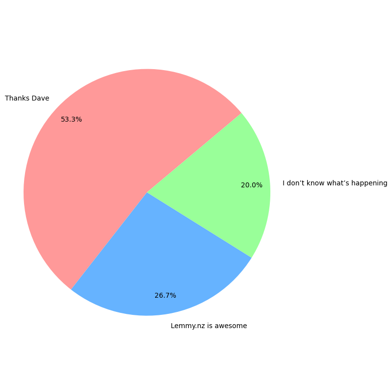
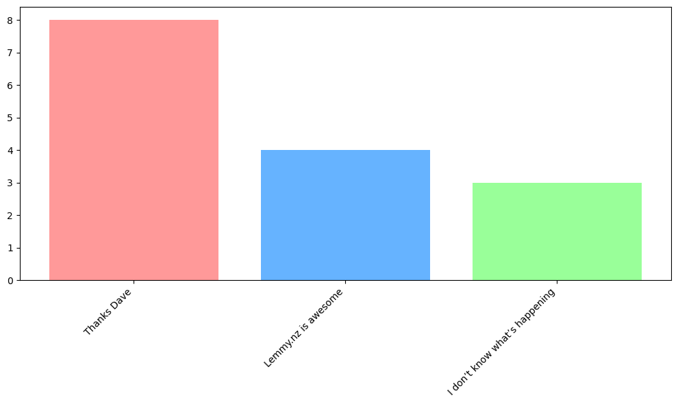
Do you have any other feedback about lemmy.nz, this survey, or anything else?
I’ve grouped the feedback into generic answers. “I don’t know what’s happening” encompasses answers from (paraphrased) “I’m new and not sure what to think of Lemmy” through to “I’ve been here a year and still don’t understand how it all works”.
Bar graph
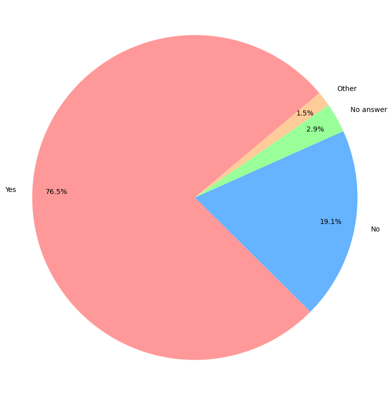
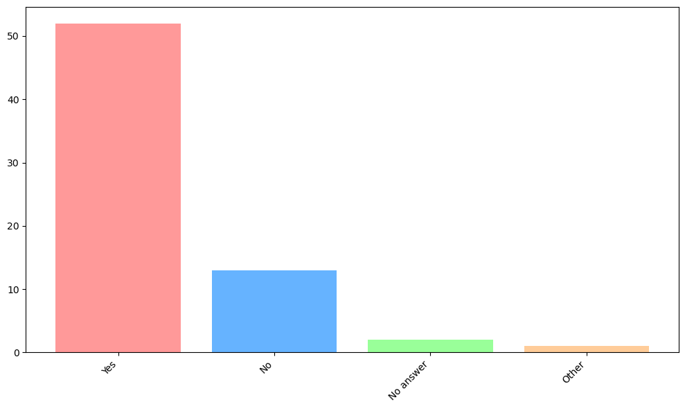
Are you happy for your responses to be released in a public data set?
We had 52 respondents happy to have their responses released publicly, and a further user marked as “Other” that was happy to have their data included with some parts redacted.
Please let me know if you are interested in doing some analysis on these results. I wanted to preemptively collect consent but I’ll only release the data if someone is actually interested in doing some analysis.
Bar graph
Final comments
Thanks to everyone for filling in the survey, and bearing with me as I wrote up the results. I had thought I’d get to do more analysis on subgroups, but you get quite small groups when you do that and so it’s hard to draw conclusions from. If anyone has ideas for further analysis, leave a comment!
Thanks this is an interesting read. Probably unsurprising the strong technical job bias and the demographics that goes along with that.
The spoiler tag hides the text of the bar graph but not the actual image!
In my experience in IT, there are a huge range of ethnicities! So I was expecting a much wider range.
Which app are you using? In a browser it seems to work. Our top three mobile methods were Voyager, mobile website, and Jerboa, and the spoiler tags seem to work (mostly) fine in those!
Sigh… no it was user error. I happened to click the spoiler tags on a place were there were sequential bar charts (I was expecting pie/bar) so the bar chart ‘not hiding’ was actually just the next one in the sequence appearing.
Haha nice! There were some things that didn’t really make sense to show as a pie chart so they don’t have one. Probably my fault for mentioning spoiler tags might not work - if I hadn’t mentioned it you might not have been expecting it 😆.
Do you not get a user-agent like tag in the lemmy logs which tells you who’s connecting with which client?
Sure! But it doesn’t tie a specific userame to a specific client. And federated services are mostly bot chatter between servers to sends posts and the actions for users on other instances. And between that are the pings from apps and frontends to check for notifications and that sort of things. Then to work out proportions I’ve gotta somehow identify which requests are all from one user then only count them once, and of course the same user can use different apps. Could I use the logs to check the apps people are using? Sure.
But it’s easier to just ask people.