we’ve got monitor edge barriers! the feature i missed most from windows is here i’m so pleased!
zeus ∽↯∼
Il faut imaginer Camus hébété.

- 110 Posts
- 326 Comments
Joined 1 year ago
Cake day: June 15th, 2023
You are not logged in. If you use a Fediverse account that is able to follow users, you can follow this user.
i doubt it, i don’t see why an icon pack would have a systemd service. probably something to do with moonlight [nvidia]
still, thank you for introducing me to a new* icon pack

 4·4 months ago
I have to say I like this one
image

kde can still look like that too:
i really hope oxygen does get ported to plasma 6, and not dropped like the air theme has been
i must say though, as much as i prefer the look of light themes usually, i think dark themes are objectively[1] better unless you’re in bright sunlight: images and video aren’t affected by themes, so dark themes put the focus on the media, whereas light themes can wash them out
(current theme setup)

this is conjecture, i haven’t done any studies ↩︎
 2·8 months ago
deleted by creator
 1·9 months ago
i’m so impressed you can tell the difference
now you say it i can see a slightly different style at the front, but i did think it was just the same image with a different background
lemm.ee has temporarily disabled all image uploads actually, due to the csam spam (see the post on [email protected])
/0 has recently released his ai anti-csam filter though, so hopefully they should be back soon

no i mean i have no idea which joke, you muppet

i have absolutely no idea which one

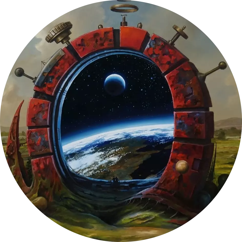
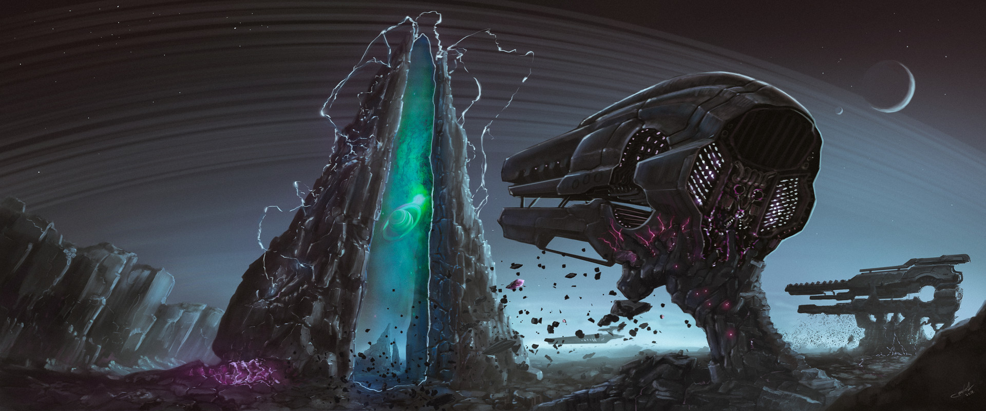
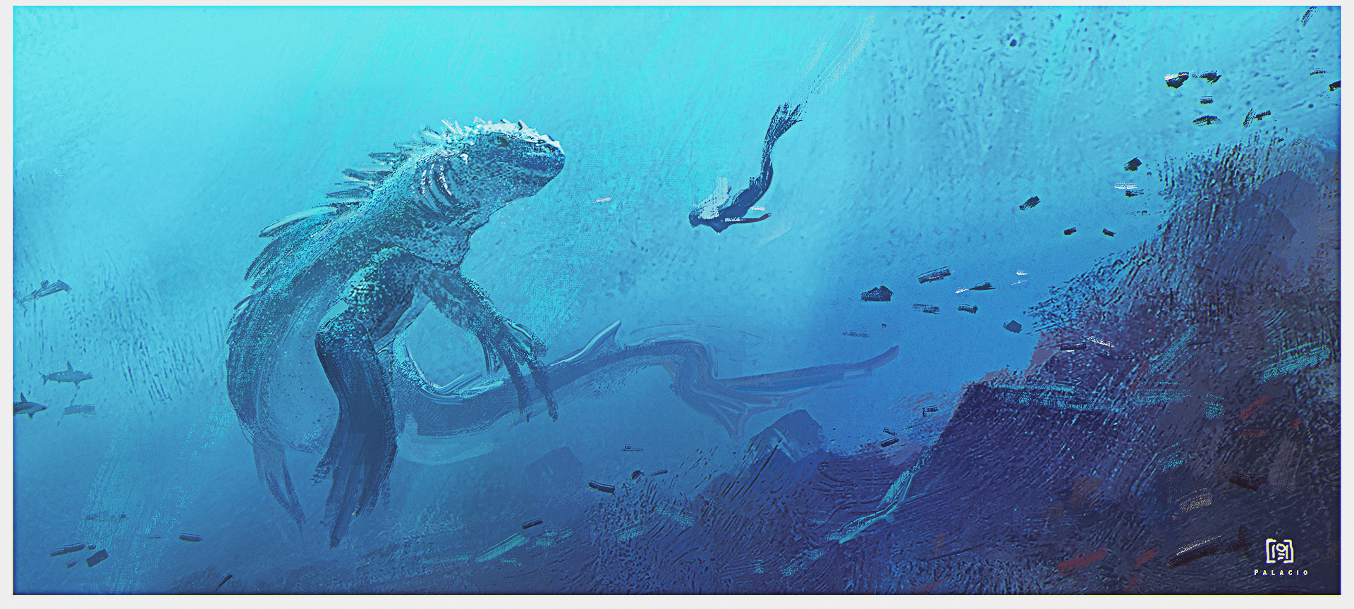
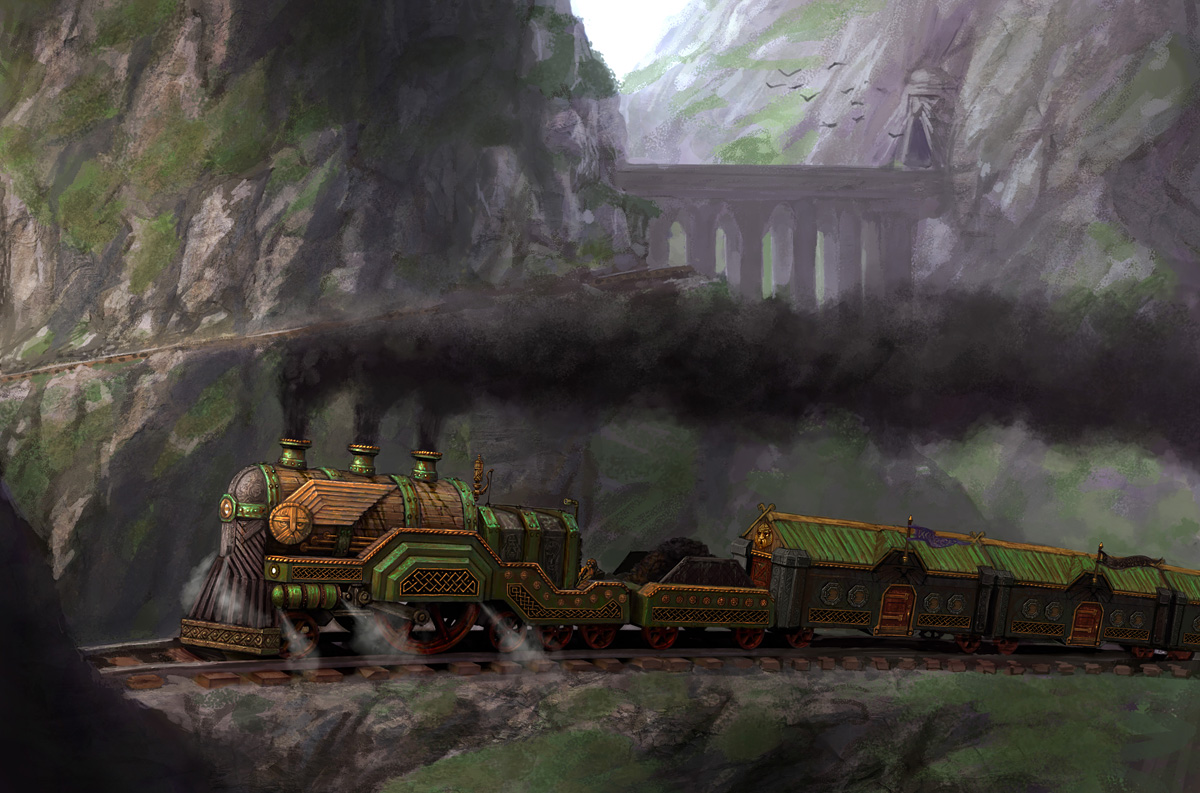
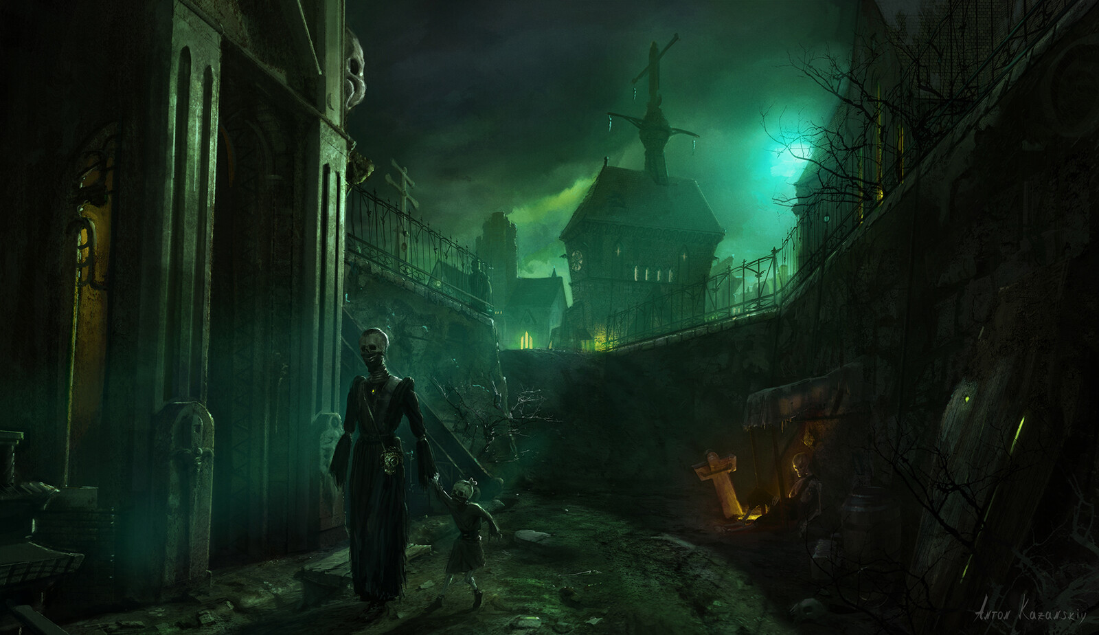
oh this is so gorgeous! also it fits the title so well
i can’t believe i actually follow this artist but i missed this piece?
ah, that makes sense
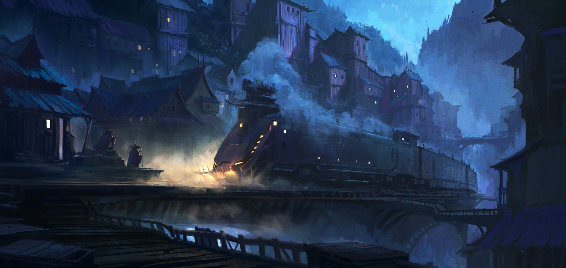
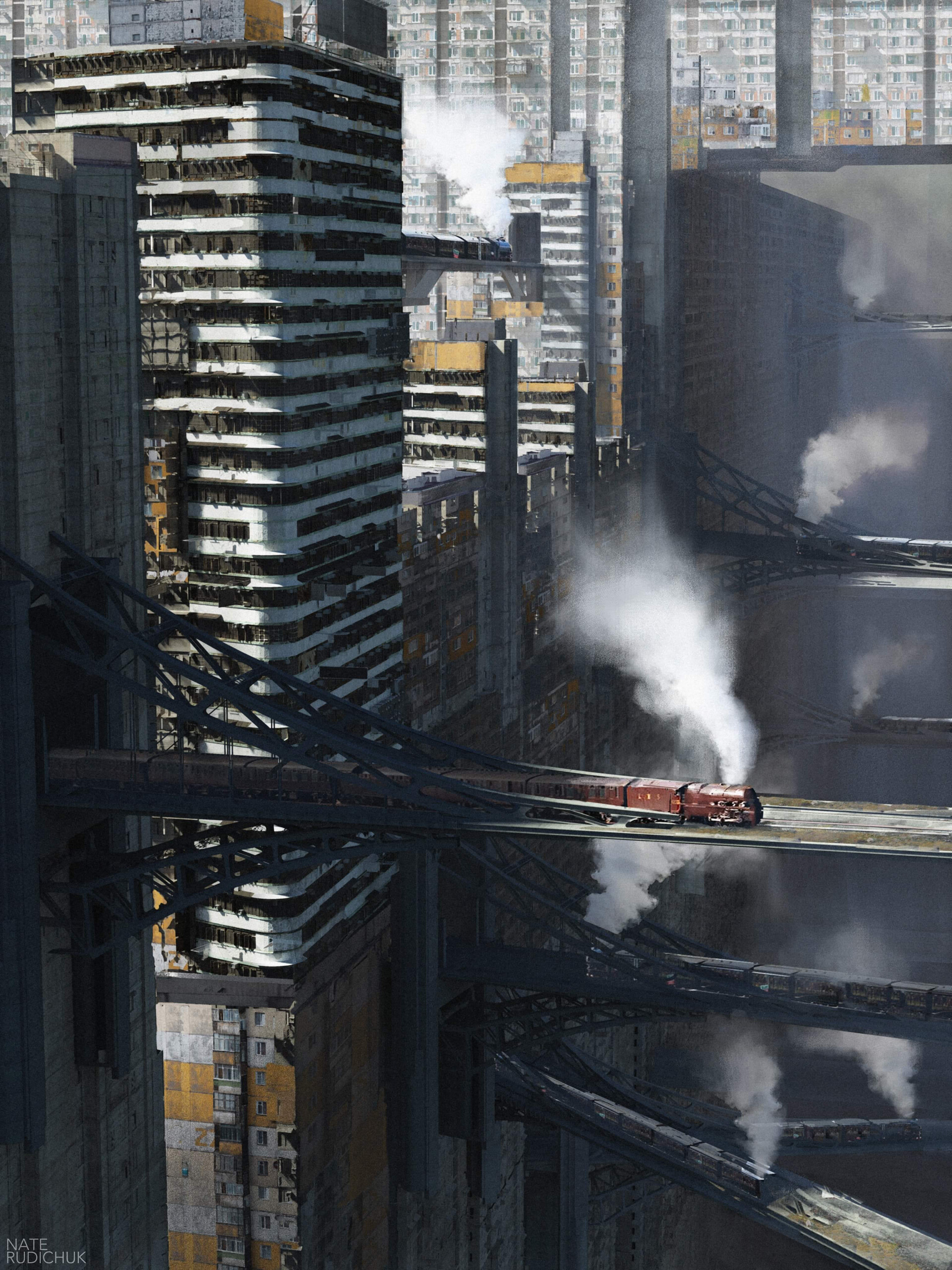
although they’ve both chosen almost exactly the same camera angle, too
i do slightly prefer this one though, i like the cyrillic and led readout (also i appreciate that you’ve chosen the nicer lighting of the two from this post)
ah, a certain sense of deja vu…
(which i haven’t got around to posting, i know)
 1·9 months ago
i think it depends
i mean it looks shitty on my screenshot, but that’s because it’s a phone not a tablet. my eyes can move easier than my thumbs, so i’d rather glance than have to scroll twice as far
i disagree with empty space usually, but i don’t disagree that it would be better filled with, say actionable buttons rather than text that needs to be read
¯\_(ツ)_/¯ i’d find it much better as it’s more information dense. that’s why apps have preferences.
but i was just pointing out that there’s definitely a “sensible alternative”

I wonder if they could use firefox sync
i imagine it’d be more work as it’s not pre-built, but samsung internet does it so maybe mozilla are a little more lax with who uses their services


honestly this is a part of why i basically stopped using lemmy a few months back
(i think it’s partly what put martineski off too, although i don’t want to speak for him)
not my own comments, but i noticed more and more comments being downvoted for daring to say something controversial. i remember back before we had to have the “this is not a disagree button” hover text on reddit, now we don’t even have that