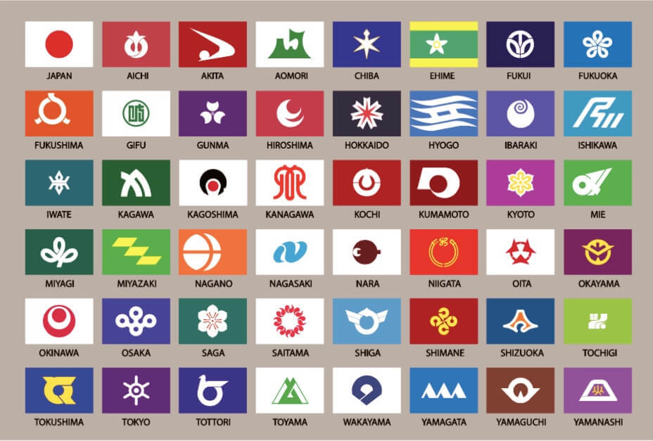
I think they all look pretty cool and have their own distinctive aesthetic while being thematically consistent (e.g. they look like they’re part of the same collection). That being said, I do definitely get “logo” vibes from quite a few, like you could have told me they were sports team logos and I’d believe it. Also Akita straight up looks like a Nike swoosh lol.
i love many of these, but a family crest on a field of color isn’t necessarily the most creative design, but i really like the consistency and history behind some is these. like some of these were flown during the warring states period. that alone makes them kinda cool.
that said, ishikawa looks like a b2b tech company logo.