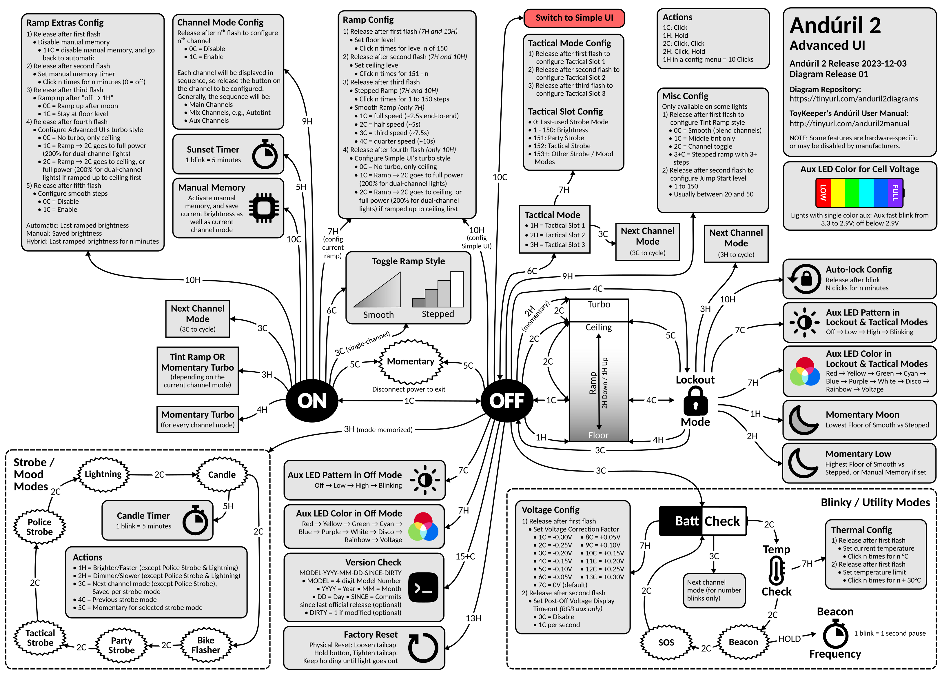
Advanced UI

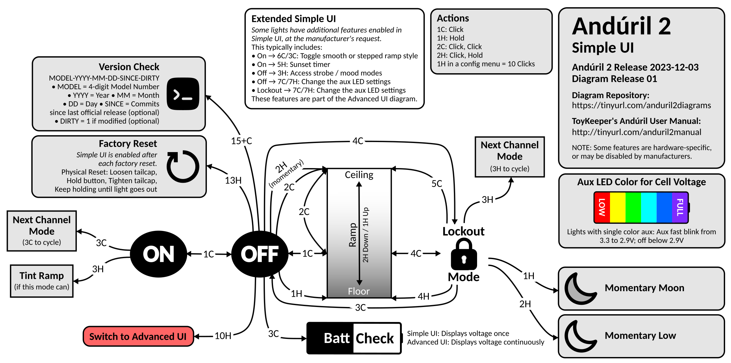
Simple UI
Background: This was 100% inspired by Lux-Perpetua’s Andúril 2 UI diagram on BLF. In fact, Lux’s diagram is so good, that I would have been happy to just use it except for one thing: the source isn’t published, so you can’t modify it. I also wanted to be able to keep it up to date with u/ToyKeeper’s code. So I created my own…
This is where I intend to store all of my Anduril 2 UI diagrams, and any updates to them. Since ToyKeeper split off the multi-channel version of Anduril 2, I have created two new diagrams for it:
Anduril 2 Multi-Channel Advanced UI (PNG)Anduril 2 Multi-Channel Simple UI (PNG)
Diagrams now hosted on GitHub.
Yeah, it got complicated enough that I could no longer fit the Advanced and Simple UI diagrams on a single page, so I had to split them.
As always, you are free to do whatever you want with these diagrams. I make these for myself, and I’m happy to share them with the community. You can find the source MS Visio file here. Feel free to make your own copy and modify it to your heart’s content. The Visio file contains several pages:
Single-Channel - Advanced/Simple UI diagram for the single-channel version of Anduril 2. I still need to update and post it.Multi-Simple - Simple UI diagram for the multi-channel version of Anduril 2.Multi-Advanced - Advanced UI diagram for the multi-channel version of Anduril 2.Diagram Parts - Various bits and pieces that I use in the various UI diagrams.
If you find any errors, please post a comment here. I try to keep the diagrams as accurate and up-to-date as possible, but you know, life happens. Enjoy!
Updates:
- 2023-07-06: Fixed several issues pointed out here. Thanks @lowprofile!
- 2023-07-09: Fixed a few more issues pointed out here. Thanks again @lowprofile! Also trying to get the wording in a few places more inline with the text manual.
- 2023-07-15: Updated for r728 which added channels for red, yellow, green, cyan, blue, purple, and white. Added 4H from ON to Momentary Turbo. Added 3C from Tactical Mode to Next Channel Mode. Several other minor fixes. Huge thanks to @lowprofile for continuing to provide valuable feedback. This multi-channel diagram has been a journey!
- 2023-07-17: Multiple visual enhancements/fixes thanks to @lowprofile. Incremented the version to r732 even though there were no material impacts to the diagram.
- 2023-07-20: Modified the ramp part of the diagram to reflect the default Anduril 2 configuration (2C to Ceiling). Thanks again to @lowprofile for feedback. I also switch from revisions to build dates as suggested by ToyKeeper.
- 2023-07-22: Made several corrections to the Simple UI diagram that I had been neglecting. Also made a slight wording change to the ramp config boxed on the Advanced UI diagram. Thanks to @lowprofile for all corrections. Finally, I incremented the build date to 2023-07-21, although there were no material impacts to the diagrams.
- 2023-08-06: Several cosmetic fixes to the Simple and Advanced UI diagrams thanks to feed back from @lowprofile. Also incremented the build date to 2023-08-04, although there were no material impacts to the diagrams.
- 2023-08-07: Several clarifications thanks to feedback from @lowprofile. Also incremented the build date to 2023-08-07, although there were no material impacts to the diagrams.
- 2023-08-10: Several cosmetic fixes to the Simple and Advanced UI diagrams thanks to feed back from @lowprofile.
- 2023-10-03: I’m embarrassed to admit that I missed an update from the 2023-08-27 release in which “smooth steps” were added (see the Ramp Extras Config). Other than that, there have been no material changes to the diagrams.
- 2023-11-07: I finally got around to making a couple of updates suggested by @lowprofile. In the Strobe Modes on the Advanced UI diagram, you’ll notice that 3C allows you to save the channel mode per strobe mode. Very cool!
- 2024-01-01: Last update here on Lemmy. Lemmy is great, but it makes more sense to host the diagrams on GitHub when I can issue diagram releases corresponding with ToyKeeper’s Anduril 2 releases. From now on, please access the diagrams there. It’s a fairly significant update, so please be sure to read the README.


For your consideration, here are some more suggestions (Advanced UI):
Add
4HforMomentary Turbo, possibly below the present3HforTint Ramp OR Momentary Turboon the very left; cf. text manual. This4His esp. for channel modes that use3HforTint Ramp, but I have checked this4HforMomentary Turboto work in all channel modes, including those with already3HforMomentary Turbo, i.e. withoutTint Ramp.In the Strobe Mode Actions, add
Police Strobeat1H: Brighter/Fasterand2H: Dimmer/SlowerbeforeLightning, in order to read(except Police Strobe and Lightning), cf. text manual.Believe it or not,
3CforNext Channel Modealso works in Tactical Mode (6CfromOFF), I checked. I suppose this is covered by “Any Mode” in the text manual. So3CforNext Channel Modeshould also be added to Tactical Mode.As to the diagram layout for #3, to save some space, it might be sufficient to just write
Next Channel Mode (3C to cycle)for Tactical Mode, without listing all the individual channel modes once again.Relating to #4, as to the diagram layout, to save some space, it might also be sufficient to just write
Next Channel Mode (3H to cycle)for Lockout Mode. The individual channel modes are already listed at3CfromON, so they might not have to be repeated here again. At the same time, this would free some space for the Ramp image, which has been shrinking quite a bit due to the added3Hbox for Lockout Mode.Relating to #5, possibly place the
3Hfrom Lockout Mode below1Hand2H, visually somewhat separated from10H,7C, and7H, as this3Hnot only refers to Lockout Mode, but extends toONas well.Use
15+Cinstead of presently15CfromOFFforVersion Check, cf. text manual. I am always glad to not have to count to exactly 15 when doing a version check.While at it, in Ramp Extras Config, Item 1, use
1+Cinstead of presently1C = disable ..., cf. text manual “(doesn’t matter what value the user enters at the prompt)”.I’m still in the process of making changes, but here’s what I’ve done so far…
Excellent recommendations, and I appreciate your help. Now working on the channel modes…
Great, thank you very much! What a beast of a diagram, and all is looking fine to me.
Possibly, if not too much hassle, as to #5 and in particular as to the Ramp image, a few visual suggestions, since to me the Ramp image looked a little clearer in previous diagram revisions:
a. Am I correct in assuming that the arrow from
2HfromOFF, momentary Turbo, now does not point to the same level as the arrow from2Cfrom Ramp anymore on purpose? This might just take a little while to get used to, yet visually, this might look like the two arrows are pointing to differing brightness levels. Maybe have them point to the same level at the very top of the Ramp image again?b. Moreover, the arrows from
2CfromOFFas well as from5CfromLockout Modenow appear to point to a level slightly above the Ceiling level line, which might lead to a slight visual disorientation as well. Maybe have them point straight to the Ceiling level line in the Ramp image again?c. This might have come up before, but lastly, it struck me as odd that in the Ramp description, it reads
1H Up / 2H Downfrom bottom to top, with the arrow next to1H Uppointing down to Floor, and the arrow next to2H Downpointing up to Ceiling. Maybe have it read the other way around,2H Down / 1H Upfrom bottom to top?d. Speaking of visual matters: The timer symbol in
Candle Timerhas been squeezed horizontally in the current diagram revision. In previous diagram revisions, it used to have the same shape as inSunset Timerand inBeacon Frequency. Maybe straighten theCandle Timersymbol again?e. Totally unrelated, this also caught my eye: With the slightly changed visual arrangement, the text
3H (mode memorized)fromOFFfor theStrobe Modeshas meanwhile come very close to the textDisconnect power to exitforMomentary. Maybe move the text3H (mode memorized)a bit to the left to visually separate the two texts?I really need to do a better job of QC on this diagram as it gets more complex…
a. You are correct, and I have fixed it.
b. Correct again. Resizing that Ramp diagram wreaked havoc!
c. I had adapted this from Lux-Perpetua’s original diagram, but I see what you mean. I changed it per your suggestion, and it does make more sense.
d. Yep, I squeezed the symbol unintentionally when shrinking the text box. Fixed.
e. Excellent suggestion! I don’t know why I had it all stacked in there. Fixed.
I also noticed that ToyKeeper has issued four more revisions since yesterday, but I don’t believe that any of them impact the diagram.
As always, thank you for the feedback on the diagram. I need folks like you to help me keep it straight.
Awesome, thanks! I am happy to help.
And I did not notice an impact on the diagram in ToyKeeper’s latest four revisions either.