Beaver @lemmy.ca to Data Is Beautiful@lemmy.mlEnglish · 15 days agoCost by Protein Sourcelemmy.caimagemessage-square63fedilinkarrow-up1286arrow-down122
arrow-up1264arrow-down1imageCost by Protein Sourcelemmy.caBeaver @lemmy.ca to Data Is Beautiful@lemmy.mlEnglish · 15 days agomessage-square63fedilink
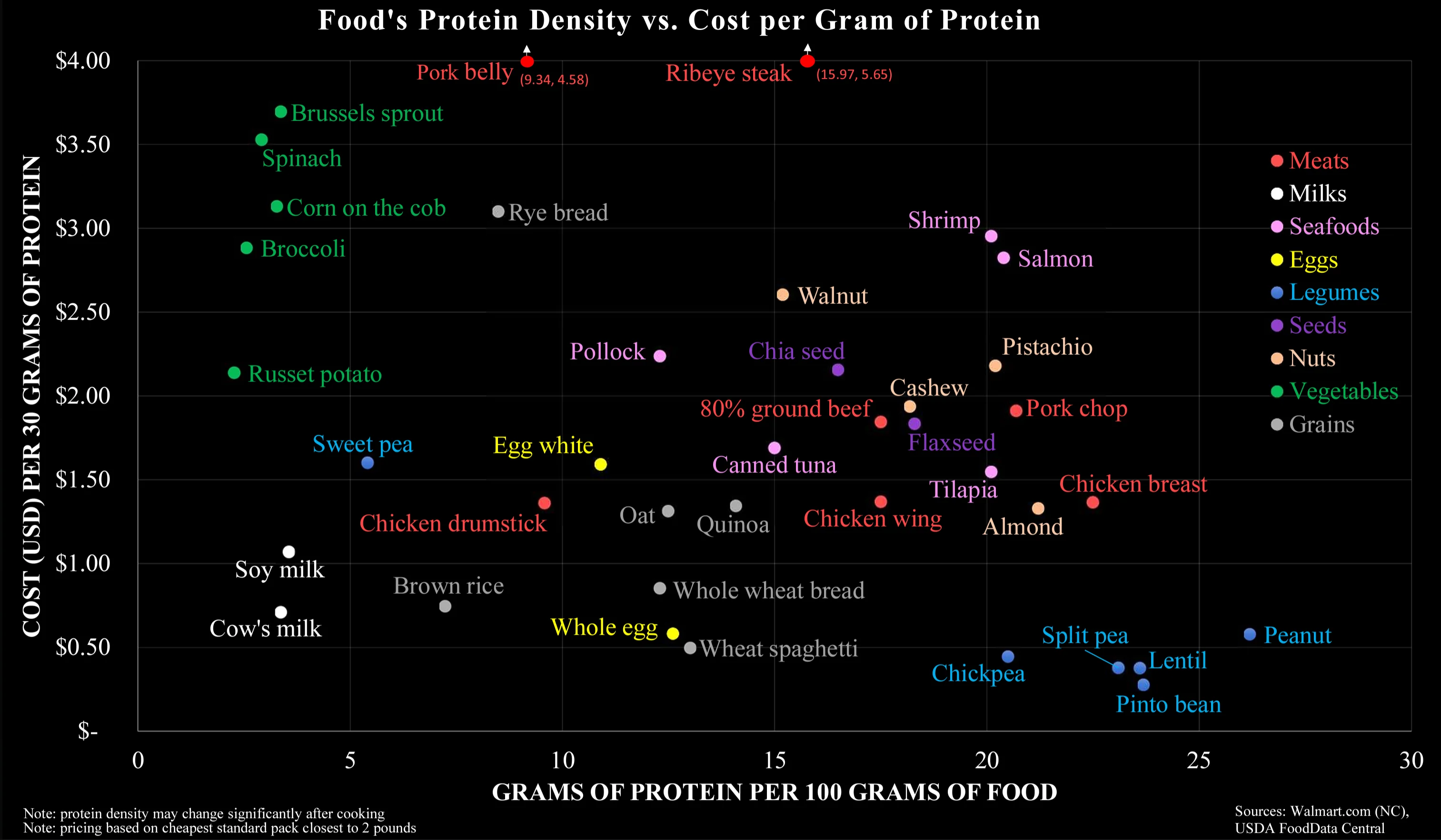
minus-squareMartín@lemmy.worldlinkfedilinkarrow-up1arrow-down5·15 days agoTo me it seems that your interpretation completely disregards the Y-axis. On the other hand, I wouldn’t think the colour coding does a good job in separating along the carnivorous-vegetarian-vegan scale.
minus-squaremonomon@programming.devlinkfedilinkarrow-up1·15 days agoIt’s not that they are separated on the chart, but that they are comparable (on both axes), that impressed me.


To me it seems that your interpretation completely disregards the Y-axis. On the other hand, I wouldn’t think the colour coding does a good job in separating along the carnivorous-vegetarian-vegan scale.
It’s not that they are separated on the chart, but that they are comparable (on both axes), that impressed me.